Archive

competitions

Community design has never been thought-of highly by architects in general. Mostly because it has not been seen as sophisticated enough and additionally because it implies that the architects are not that essential if the community can do the work on its own.

In this RIBA exhibition the word community in the title does not refer to the designer, but to the “client”. Most importantly it refers to the fact that these spaces are used by the public. Nowadays when austerity and budget cuts affect public spaces immensely and the always powerful capitalism is solipsistically interested in profit, such projects are more important than ever.

community1

Loch Lomond Pavilion by Angus Richie and Daniel Tyler

In all of the four projects which are presented in this exhibition the architects are already part of the community or if they are not from the beginning, they end up being by the end of the project. In other words there is a degree of emotional involvement on their part that goes far beyond their fees, reputation or their professional integrity.

I was drawn to this exhibition because of its subject. Community is in many ways the opposite of the corporation. A community’s goal is that the many gain the most simultaneously. Most importantly there is no antagonism and competitiveness is not in the agenda: No one gains by the loss of anyone else. Of course this as a concept is thought to be quite Utopian, or rather we are trained to think that it is. Sometimes however, it is achievable easier than initially thought. And this exhibition shows us how by the use of an experiential display: each project is presented in a structure that either is a re-created part of the original, or some material or artefact that is used in the original project, is on display.

Community2

Old Manor Library by Apparata Architects

The first one is a little pavilion that Scottish young architects Angus Richie and Daniel Tyler, began as their design thesis when still at university. Their concept of reflective box-like structures won the competition organised by Scottish Scenic Routes, a government-founded initiative to promote tourism. Constructed and placed around Loch Lomond, the pavilions are meant to engage and intrigue the visitors who would want to enter them and experience the unique views framed by the structure. The cabin fragment present as part of the exhibit is the first spatial experience for the visitor. Inside it there is a video screened of the actual structure in location which offers a multi-layered experience of entering the structure, in order to see a video of it in location.

Community3

Old Manor Library by Apparata Architects

The second project is the Old Manor Library in Manor Park, East London. The Grade II listed building was left derelict from years of misuse and lack of maintenance. Create London, Bow Arts, Newham Council and Greater London Authority commissioned a competition for its renovation which was won by Apparata Architects. Part of their winning proposal was their specification of local suppliers and tradespeople for the restoration boosting the local economy. The involvement of the architects in the project was literally hands-on as they became the contractors themselves offering along with their technical knowledge, actual manual labour. Along with a team of volunteers and local tradesmen they stripped the existing envelope of the building to its structural parts and re-configured a layout which emphasised the building’s communal nature. Eventually along with several community groups housed their offices in the renovated Library.
 

community4

Coniston Mechanics institute by Takeshi Hayatsu Architects


Next project presented is the Coniston Mechanics institute in Lake District which was founded in 1852 to improve the education of the copper-mining community. The project was led by no other than John Ruskin who lived there. The building remained central in the town’s life for 100 years before falling in misuse and started to deteriorate.

Community5

Coniston Mechanics institute by Takeshi Hayatsu Architects

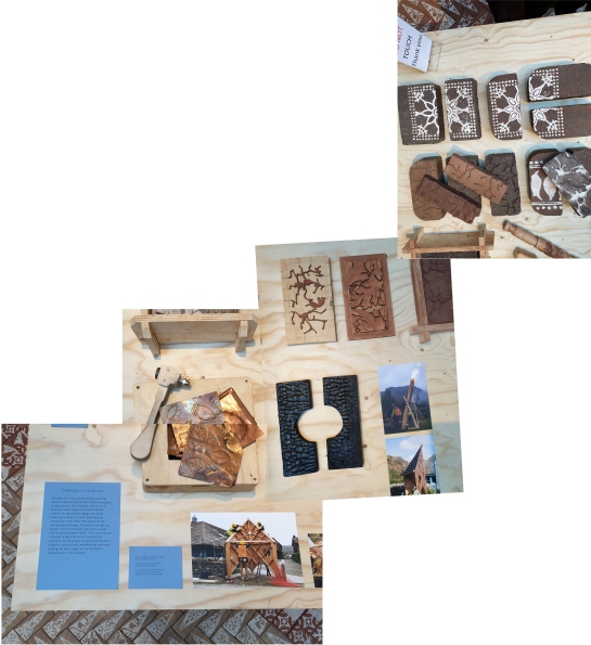
Takeshi Hayatsu Architects (who also designed the layout of this exhibition) were involved in the renovation of the Institute, reflecting their interest in collaborative architecture. They also involved their students from Central Saint Martin’s unit called: “Reworking Arts and Crafts” and their creations like the outdoors communal bread-oven, the copper-clad information kiosk and other handmade artefact are on display. Also the decorative bricks that are made there have been used to create a beautiful floor for the project’s little pavilion within the exhibition. Part of the institute is also the honest shop, where artefacts are sold in a price that the buyer considers fair. A little shop is set up within the exhibition as well.

community6

Hastings Pier by dRMM


A small ramp ascents from the Mechanics Institute exhibit to the last of the projects that is presented in this exhibition which is Hastings Pier. The Pier along with its gradual deterioration eventually also caught fire. Its complicated ownership status (in public use, eventually bought by a private owner in 2017 and then through a private share scheme local residents became part-owners of the pier) did not make renovation works easy. The trust that was funded after the first public meeting in 2006 raised the funds (majority from Heritage Lottery fund) and involved dRMM led by Alex de Rijke who is a pioneer in timber design and construction.

community-7

Hastings Pier by dRMM


As mentioned very eloquently in the introductory text of the exhibition: “Public buildings offer spaces to meet, participate, learn and play. They can improve our health and well-being, enable interaction across diverse social and demographic groups, and create a sense of community and civic identity through placemaking.”

The very low importance that has been given to them lately is obvious when we see that the first budgets to be cut because of austerity, are the community operated ones. And this is sadly telling of many sociological and political problems that this country is currently facing. When communities are not deemed as important enough to invest in, something is really wrong in our society. Fortunately, there are communities that find ways out of the dead-end through self-organisation with the help of like-minded designers. And this exhibition is important because it clearly demonstrates that.

The exhibition will be on until the 27th of April 2019

Have a look at their website here

lou-khan-1

Megalithic, minimal architecture is most definitely not my cup of tea. Yet weirdly the Indian Institute of Management in Ahmenabad by Louis Khan is one of the most beautiful buildings I have ever seen in my life. Kahn stated that the concept behind it was to wrap the building with ruins in order to generate passive climate control. This is how genius he was, he created poetry by the use of absolute, strict logic. How many other architects or artists were ever able to do that? The way that I am moved by Kahn’s architecture can only be compared to the feeling I get when I look at images of Gordon Matta-Clark’s art. A delightful tightness in the stomach is how I would describe it. Vertigo but of a pleasurable kind, similar to that one feels facing natural grandeur like looking down from the top of a cliff.  I always thought that Matta-Clark was inspired by Khan and this exhibition in the Design Museum does not fail to mention there was a connection between the two.

Top picture : Indian Institute of Management, Ahmenabad / Bottom pictures: Gordon Matta-Clark, Conical intersect

Top picture : Indian Institute of Management, Ahmenabad / Bottom pictures: Gordon Matta-Clark, Conical intersect

Khan was brilliant and apparently more dedicated to his work than most of his peers. However he died by heart attack in a train station’s toilet with a debt of half a million dollars. Apparently he was too much of a dreamer. A true artist who never even considered to balance cost and quality in his art. He went to all lengths, he slept on the floor of his office working at all hours, calling his colleagues to complain about something at 4 in the morning and expected the same degree of dedication from everyone. He developed schemes for projects without knowing if he would ever get the commission. He continued to ameliorate finished projects when the clients have long stopped paying him. Hence the debt. Money was not important, ever. Architecture was important.

Left: Louis Khan's notebook / Right: Down town Philadelphia study (not built)

Left: Louis Khan’s notebook / Right: Down town Philadelphia study (not built)

Often his non-negotiable views on architecture though were to cost him grand commissions like that of designing the centre of Philadelphia. Even though he was invited to produce a scheme, his concepts were never materialized because they were considered too utopian. This failure of his is documented at the beginning of Design Museum’s exhibition and the public is therefore warned about the architect’s seemingly unrealistic intentions.

In one of the videos screened in the exhibit, Mario Botta says that “Lou” was not only fascinated with the outcome of his work, the built product, but with the process of creating it as well. Regardless of how obsessed he might have been with the artistic process, science and construction were still extremely important aspects of his work. Kahn among other thing is known for his invention of servant and served spaces.

Yale Art Museum. Tetrahedral ceiling 'servant' space

Yale University Art Gallery. Tetrahedral ceiling ‘servant’ space

An example is the tetrahedral ceiling grid for Yale University’s Art Gallery, the geometry of which is revisited at the Philadelphia City Tower project, a massive model of which can be found in this exhibition.

Philadelphia Tower project. (Was not built)

Philadelphia Tower project. (Not built)

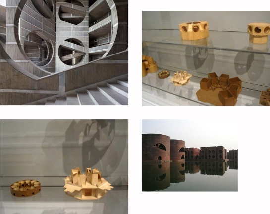
In general I enjoyed the models I saw at the Design Museum a lot. Some of the most fascinating ones are naturally the original work models that his office produced for the capital of Bangladesh in Dhaka. Those rough cardboard jewels look like geometric puzzles that one is challenged to solve and they materialize perfectly their creator’s complex dream for space.

The Capital of Bangladesh in Dhaka. Building and original models

The Capital of Bangladesh in Dhaka. Building and original models

All of Kahn’s values which were ultimately ingrained in his architecture are highlighted in this exhibition: science, community, landscape, timelessness. This is achieved with simple but eloquent texts, videos and photographs but most importantly with original hand drawings, sketches and models. This is why this exhibition is not to be missed, because it displays masterpieces that once were only humble traces of an architect’s mind. Rough doodles on a piece of paper meant to instigate a conversation with an employee or client.

Top: Exeter Academy Library / Bottom: Kimbell Art Museum

Top: Exeter Academy Library / Bottom: Kimbell Art Museum

Many of his buildings did not look very impressive from the outside. The exteriors of Exeter Library and the Kimbell Art Museum for example resemble factories. Upon entrance however they unfold miraculously proving that the experience of the person who uses them was what really mattered to Khan.

Similarly the few houses he built show his intentions of designing them to become homes to their owners and not self-absorbed works of art. In general the “quality and not quantity” aphorism is very appropriate for Louis Kahn’s architecture.

Original drawings sketches of Louis Kahn's house designs. Model: Vitra reproduction

Original drawings sketches of Louis Kahn’s house designs. Model: Vitra reproduction

After visiting this exhibition I remembered watching Nathaniel Khan’s documentary about his father entitled My Architect, back in 2003 and decided I needed to watch it again. I remembered liking the film the first time I saw it and I did again now. Regardless of the fact that Nathaniel Kahn is on a very personal journey to settle his unresolved issues of abandonment with his father and too much personal information is revealed in the process of doing that.

Salk Institute of Biological Studies

Salk Institute of Biological Studies

Naturally I was surprised and at times appalled by how horribly selfish and insensitive Kahn appeared to be with his three parallel families. Nonetheless as Roland Barthes has stated (in his Death of the Author essay), the creator’s personal story is not and should not be considered while evaluating his/her work. Louis Kahn was an architectural genius who inspired and motivated hundreds of students during his years of teaching and later on thousands of architects who were acquainted with his work. Not to mention the effect he had on the lives of the users of his buildings.

Capital of Bangladesh Dhaka

Capital of Bangladesh Dhaka

Ultimately there is no doubt that Kahn was an exceptionally inspired idealist of an architect. His legacy could not be described more eloquently than by the words of his friend and colleague B.V Doshi who Kahn had his last dinner with the night before he died.

Matter in spiritual terms was what mattered to him. Silence mattered to him. The enigma of life mattered to him. Those are not normal discourses but this is what he liked to talk about. When someone can understand those things he cannot be a normal person. He must be a highly cultivated soul.”

The exhibition will be on until the 12th of October. Visit Design Museum’s website page for it here

Watch Nathaniel Kahn’s documentary “My Architect. A son’s journey” here

house-of-muses1

The House of Muses is an interesting little installation that was commissioned by the Museum of London and is placed under its entrance canopy. Swiss architecture/design collective GRUPPE won the competition held for it and the structure is shown as part of London Architecture Festival 2014. It is inspired by London’s historic architecture and specifically by Sir Christopher Wren’s St. Alban’s Church, the tower of which is the only part of the building that survives. I find the pavilion rather elegant while also quite successful in its attempt to remind one of classical forms without simply reproducing them. Post-Modernism’s caricaturing of similar styles is certainly avoided here. On the contrary the references in colour and geometry are there but slightly shifted.

St_Albans_London

The pavilion is supposed to be a fragment of classical architecture but one is unable to identify where exactly it has been taken from. It is not for example a fragment of a column because it does not have the right shape. It reminded me of learning how to draw elevations of ancient Greek plaques with decorative motifs and how difficult it was to make the lines meet using the compass. It required a very steady hand, precession and confidence.

house-of-muses2

The one thing that I disagree with is its placement. The canopy over it is just too close to the top of the installation and the whole thing feels a bit stuck under it. Walking around it and realising that it can be entered I understood the restrictions that required for the house of muses to be protected from the rain. Still I think that another solution could have been found for this problem. I believe that cramped as it is in its current position it loses in strength and people do not pay as much attention to it as they should.

house-of-muses3

Once inside things are totally different. Its frame is wooden and looks like scaffolding. It reminded me of a theatre’s backstage where the main goal is to support the set on stage. Things are useful but are not meant to be seen hence are not required to be beautiful. I do not mean that in a negative way. On the contrary I enjoyed the juxtaposition of the white smooth exterior, with the warm informal interior. I believe that it is a good analogy for the way that architecture works in general. Much effort is invested in the appearance of buildings while what keeps them standing, the foundations, the structural frame, the utility shafts, are usually not beautiful but still truly essential.

As far as the interactive concept I am not entirely sure. The tags have random things written on them by the children that have entered the installation. I do not really find anything wrong with that. After all this is a museum visited by many schools so if the declaration of a teenage crush is what its visitors have to say, oh well, so be it.

House of Muses will stay at the Museum of London until September 21st

Find the Museum’s page about it here

GRUPPE’s website here

London Festival of Architecture program here

house-of-muses4

June is London Festival of Architecture month. For the architectural enthusiasts there is a vast collection of events, installations, exhibitions and talks available to choose from. I always go into a frenzy at the beginning of the festival, then take a break and finally panic towards the end of the month to catch every exhibition before it ends. The easiest and most enjoyable installations to visit are the numerous pavilions and follies that pop-up in the city, the most famous of all being naturally the Serpentine Gallery Pavilion in Kensington Gardens. However there are quite a few structures of a more humble scale to be found in the city. The competitions for those ‘other’ pavilions are not entered by star-architects but mostly by small practices and are open to students as well.

Triumph Pavilion by IPT Architects

Triumph Pavilion by IPT Architects

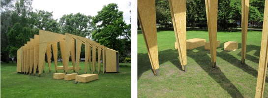
I started my folly-quest with Triumph pavilion which is placed at Museum Gardens in Bethnal Green. The competition is organised by Archtriumph a platform that launches and publishes international architectural competitions. This year’s winner was IPT a small London-based architectural practice that has a straightforward clean aesthetic and judging from its body of work, loves timber.

This year’s theme was “Dream” but unfortunately I could not find out more information about the competition’s brief in ArchTriumph’s website (a revamp of their page is much needed if I may say so). However upon my visit to the site, I found inside the actual structure a plaque that mentions some guidelines from the brief that was given to the contestants:

triumph2

This theme invites visitors to dream about a unique space, creative place, achieving an ambition or simply being inspired by a series of thoughts, images and sensations. We hope that it encourages you to dream and realise the vision of what can be”.

The text seemed as ambitious, symbolic and vague as most architectural competition briefs are. Right underneath it though, was the architect’s response and theme interpretation which I found quite interesting and according to which:

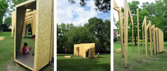
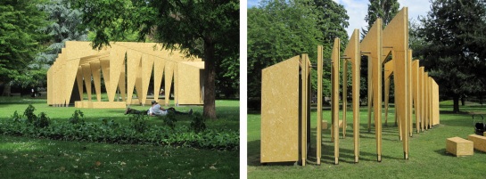
The pavilion aims to provoke discussions about architectural aspirations and creativity through exploring geometries to create inspiring spatial forms. Although there is a prescribed circulation route through the pavilion, thresholds between inside and outside are blurred and participants can weave through the spaces towards the perimeter seats for further reflection. There can be a fine line between a dream and reality, thus the perception of the pavilion constantly shifts from solidity to transparency depending on the vantage point. The pavilion structure creates inspiring and ever-changing shadows according to the movement of the sun.

triumph3

I could not have come up with a more precise description even if I tried. So I will not try. I have to say though that the impression I got from the other visitors that I encountered was that people were generally pleased and intrigued by it. I saw children chasing each other and truly weaving their play in the structure. I saw someone sit and read a book in its fleeting shade and I also saw a couple sitting on the grass to simply enjoy looking at the pavilion while having a conversation.

triumph4

This architectural creation except for being a simple but beautiful structure, has actually achieved its goal, which is for people to enjoy and use it. Similar follies like the Serpentine pavilion, receive much more press because their creators are more often than not star-architects. Somehow the fame of those architects is reflected on their projects and make them more of a self-absorbed ode to their own talent and less about those who are supposed to enjoy their building.

I do not know if it is IPT’s ethics as a practice or if the project’s smaller scale (both spatially and as far the publicity it received) renders this work more humane and real. Either way I thoroughly enjoyed my lunch on that beautiful sunny day and that was especially because of the space and atmosphere that this little structure created.

triumph5

IPT Architects website here

ArchTriumph website here

London Festival or Architecture program here

I have always been fascinated by architectural competitions, especially the ones held for projects that will never be materialised. From their entries one can really assess the designer’s architectural abilities and also map out their politics and true motives. It is the closest an architect can get to his/her student years, when being a dreamer and not a pragmatist was the norm. Anyone who studies or has a creative profession knows that sometimes the most outrageous of ideas produce the most interesting of projects.

Top left: In the Canopy by Studio McLeod / Top right: The Gassworks by Patrick Judd and Ash Bonham / Bottom left: Reclaiming the canalside by Bethany Gale / Bottom right: Kentish Town square by Urban Projects Bureau+BBUK Landscape Architecture

Top left: In the Canopy by Studio McLeod / Top right: The Gassworks by Patrick Judd and Ash Bonham / Bottom left: Reclaiming the canalside by Bethany Gale / Bottom right: Kentish Town square by Urban Projects Bureau+BBUK Landscape Architecture

In this competition held by the RIBA, the contestants chose one area (out of some suggested ones) and then focused their intervention in whatever part of it they wanted. Each proposed neighbourhood has various places that seem to be forgotten and each project’s aim was to shed new light on them. All of the short-listed entries suggest a 180 degree turn from their original use. Aldwych station turns into a spa, where people actually bathe in the tube, old phone booths are transformed into bike repair stations and a part of the BT tower becomes a cultural centre.

Top left drawings: Bikebox by Sam Rose and Hoi Kei Lo / Bottom right drawings: An Arial View by OMMX

Top left drawings: Bikebox by Sam Rose and Hoi Kei Lo / Bottom right drawings and model: An Arial View by OMMX

Architectural studies involve coming up with schemes on how to regenerate areas and scenarios of what sort of buildings to make quite often. In fact there is so much time put into developing these scenarios during student years that one would think that entering the actual profession architects would be even slightly involved in them. This is really far from the truth. Even the biggest names in the business are presented with very precise briefs that have been developed entirely by clients, companies, strategists and governments and to which the architects have not contributed anything at all. Which means we are trained to be dreamers but we actually only execute orders. This is why I always thought that being an architect is like having studied to be a chef but instead having to wash dishes for decades. This is why most architects are not happy with their jobs even though they loved their studies. And this is also why most of us are willing to spend weeks of our precious time for a competition, even if there is next to no chance to ever win it (not to say that if won, the award would not even remotely cover the cost).

Hidden light by Threefold Architecture

Hidden light by Threefold Architecture

Another important thing that popped into mind going around the rooms of this exhibition was that regeneration is often promised in a vague, generic fashion that reminds me of politicians’ schemes that are presented to the public in order to win votes. Having the objectivity to read the intentions behind such ‘promises’ is an important skill to develop because often there are potent political motives hidden behind them. In our days regeneration usually equals gentrification. Attracting rich consumers to occupy an area is the goal, while social problems and inequalities instead of being addressed, are hidden under the proverbial carpet. Poor and marginalised people are sent away from the ‘regenerated’ area as out of sight is out of mind.

Museum of Memories by Claire Moody

Museum of Memories by Claire Moody

Some decades back, patronising or naïve as they might have been, architects were trying to face social problems, no matter how difficult or even impossible it was. In our days we are trained to forget and focus on design, beauty and generally the surface of things. It is as if designers only look into a repertoire of ‘problems’ that mostly relate to the environment and the need for more culture-related places. Thus the recipe is either to create a leisure/art space or something that addresses environmental issues via recycling and the production of biological products to hit the jackpot. Everyone will think the designer really cares. By that I do not mean that there is no need for additional public or cultural centres and I am not challenging the fact that global resources have been reduced and our health and well-being are not in danger. On the contrary. However I do believe that as citizens and as designers we should all be more sensitive towards the social impact and  politics represented by the projects that claim to regenerate the areas that allegedly need it.

Cricklewood Town Square by Spacemakers and Studio Kieren Jones

Cricklewood Town Square by Spacemakers and Studio Kieren Jones

Having said that I do not want to state which projects in this competition -according to my personal opinion- were successful in addressing actual problems creatively and which not. This is something for each person to figure out on their own after careful consideration. However I do believe strongly in the importance of competitions because somehow they open up a horizon of possibilities for architects that reality has turn into cynics. Especially this competition had a very interesting subject as cities are literally filled with forgotten spaces. Ultimately, the decision to display it in an equally forgotten space, the basement of a building as famous as the Somerset House was a brilliant one.

The basement of Somerset House where the exhibition was placed

The basement of Somerset House where the exhibition was placed

I would also like to mention some projects that stayed in my memory for various reasons. Cricklewood Town Square by Spacemakers and Studio Kieren Jones which is basically a moving kiosk that creates public space where there is none. Hidden Light by Threefold Architects, which is a series of flares indicating the Victorian technology that still remains underground of the city. The Museum of Memories by Claire Moody for its Gothic qualities and for re-introducing the necropolis. “In the Canopy” which is a tree-climbing system by Studio McLeod for its playfulness. Urban Agri-Aqua Culture by Ian and Peter Wale for its ethics even though I wish they had paid more attention to their aesthetics. And finally the Bike Box by Sam Rose and Hoi Kei Lo because something truly helpful should be done for the cyclists in this city.

Top images: Aldwych Baths by Team Growler / Bottom images: installation and drawings for Aquadocks by Studio Pink

Top images: Aldwych Baths by Team Growler /
Bottom images: installation and drawings for Aquadocks by Studio Pink

The exhibition has now ended but you can find the its website here

More information about the shortlisted projects at the RIBA website here