Community design has never been thought-of highly by architects in general. Mostly because it has not been seen as sophisticated enough and additionally because it implies that the architects are not that essential if the community can do the work on its own.
In this RIBA exhibition the word community in the title does not refer to the designer, but to the “client”. Most importantly it refers to the fact that these spaces are used by the public. Nowadays when austerity and budget cuts affect public spaces immensely and the always powerful capitalism is solipsistically interested in profit, such projects are more important than ever.

Loch Lomond Pavilion by Angus Richie and Daniel Tyler
In all of the four projects which are presented in this exhibition the architects are already part of the community or if they are not from the beginning, they end up being by the end of the project. In other words there is a degree of emotional involvement on their part that goes far beyond their fees, reputation or their professional integrity.
I was drawn to this exhibition because of its subject. Community is in many ways the opposite of the corporation. A community’s goal is that the many gain the most simultaneously. Most importantly there is no antagonism and competitiveness is not in the agenda: No one gains by the loss of anyone else. Of course this as a concept is thought to be quite Utopian, or rather we are trained to think that it is. Sometimes however, it is achievable easier than initially thought. And this exhibition shows us how by the use of an experiential display: each project is presented in a structure that either is a re-created part of the original, or some material or artefact that is used in the original project, is on display.

Old Manor Library by Apparata Architects
The first one is a little pavilion that Scottish young architects Angus Richie and Daniel Tyler, began as their design thesis when still at university. Their concept of reflective box-like structures won the competition organised by Scottish Scenic Routes, a government-founded initiative to promote tourism. Constructed and placed around Loch Lomond, the pavilions are meant to engage and intrigue the visitors who would want to enter them and experience the unique views framed by the structure. The cabin fragment present as part of the exhibit is the first spatial experience for the visitor. Inside it there is a video screened of the actual structure in location which offers a multi-layered experience of entering the structure, in order to see a video of it in location.

Old Manor Library by Apparata Architects
The second project is the Old Manor Library in Manor Park, East London. The Grade II listed building was left derelict from years of misuse and lack of maintenance. Create London, Bow Arts, Newham Council and Greater London Authority commissioned a competition for its renovation which was won by Apparata Architects. Part of their winning proposal was their specification of local suppliers and tradespeople for the restoration boosting the local economy. The involvement of the architects in the project was literally hands-on as they became the contractors themselves offering along with their technical knowledge, actual manual labour. Along with a team of volunteers and local tradesmen they stripped the existing envelope of the building to its structural parts and re-configured a layout which emphasised the building’s communal nature. Eventually along with several community groups housed their offices in the renovated Library.
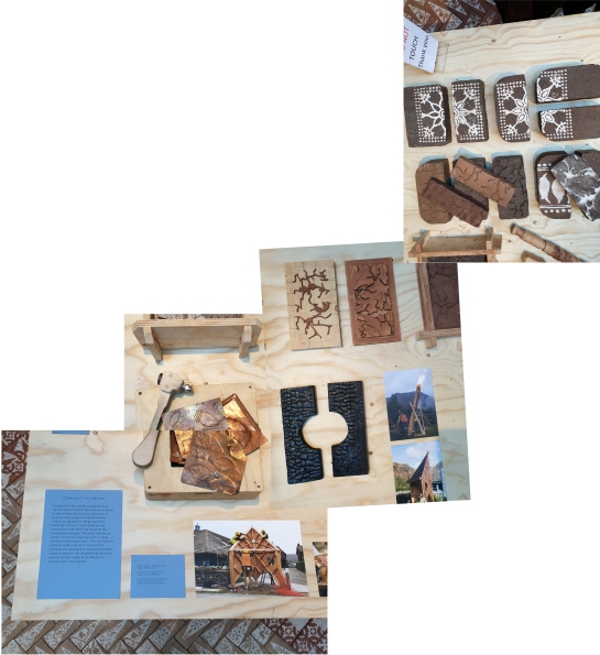
Coniston Mechanics institute by Takeshi Hayatsu Architects
Next project presented is the Coniston Mechanics institute in Lake District which was founded in 1852 to improve the education of the copper-mining community. The project was led by no other than John Ruskin who lived there. The building remained central in the town’s life for 100 years before falling in misuse and started to deteriorate.

Coniston Mechanics institute by Takeshi Hayatsu Architects
Takeshi Hayatsu Architects (who also designed the layout of this exhibition) were involved in the renovation of the Institute, reflecting their interest in collaborative architecture. They also involved their students from Central Saint Martin’s unit called: “Reworking Arts and Crafts” and their creations like the outdoors communal bread-oven, the copper-clad information kiosk and other handmade artefact are on display. Also the decorative bricks that are made there have been used to create a beautiful floor for the project’s little pavilion within the exhibition. Part of the institute is also the honest shop, where artefacts are sold in a price that the buyer considers fair. A little shop is set up within the exhibition as well.

Hastings Pier by dRMM
A small ramp ascents from the Mechanics Institute exhibit to the last of the projects that is presented in this exhibition which is Hastings Pier. The Pier along with its gradual deterioration eventually also caught fire. Its complicated ownership status (in public use, eventually bought by a private owner in 2017 and then through a private share scheme local residents became part-owners of the pier) did not make renovation works easy. The trust that was funded after the first public meeting in 2006 raised the funds (majority from Heritage Lottery fund) and involved dRMM led by Alex de Rijke who is a pioneer in timber design and construction.

Hastings Pier by dRMM
As mentioned very eloquently in the introductory text of the exhibition: “Public buildings offer spaces to meet, participate, learn and play. They can improve our health and well-being, enable interaction across diverse social and demographic groups, and create a sense of community and civic identity through placemaking.”
The very low importance that has been given to them lately is obvious when we see that the first budgets to be cut because of austerity, are the community operated ones. And this is sadly telling of many sociological and political problems that this country is currently facing. When communities are not deemed as important enough to invest in, something is really wrong in our society. Fortunately, there are communities that find ways out of the dead-end through self-organisation with the help of like-minded designers. And this exhibition is important because it clearly demonstrates that.
The exhibition will be on until the 27th of April 2019
Have a look at their website here


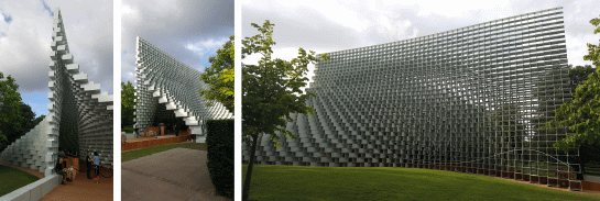
 At a time when industrial relics and retrofuturism was just getting to be fashionable they renovated an existing building, previously a power station and turned it to the hugely famous Tate Modern. The brick bulk, the landmark chimney and the cathedral-like Turbine hall compel the visitor immediately. A composition which demonstrates the importance in the simplicity of straightforward architectural gestures. What could the architects come up with that would be equally strong?