Archive

design

Community design has never been thought-of highly by architects in general. Mostly because it has not been seen as sophisticated enough and additionally because it implies that the architects are not that essential if the community can do the work on its own.

In this RIBA exhibition the word community in the title does not refer to the designer, but to the “client”. Most importantly it refers to the fact that these spaces are used by the public. Nowadays when austerity and budget cuts affect public spaces immensely and the always powerful capitalism is solipsistically interested in profit, such projects are more important than ever.

community1

Loch Lomond Pavilion by Angus Richie and Daniel Tyler

In all of the four projects which are presented in this exhibition the architects are already part of the community or if they are not from the beginning, they end up being by the end of the project. In other words there is a degree of emotional involvement on their part that goes far beyond their fees, reputation or their professional integrity.

I was drawn to this exhibition because of its subject. Community is in many ways the opposite of the corporation. A community’s goal is that the many gain the most simultaneously. Most importantly there is no antagonism and competitiveness is not in the agenda: No one gains by the loss of anyone else. Of course this as a concept is thought to be quite Utopian, or rather we are trained to think that it is. Sometimes however, it is achievable easier than initially thought. And this exhibition shows us how by the use of an experiential display: each project is presented in a structure that either is a re-created part of the original, or some material or artefact that is used in the original project, is on display.

Community2

Old Manor Library by Apparata Architects

The first one is a little pavilion that Scottish young architects Angus Richie and Daniel Tyler, began as their design thesis when still at university. Their concept of reflective box-like structures won the competition organised by Scottish Scenic Routes, a government-founded initiative to promote tourism. Constructed and placed around Loch Lomond, the pavilions are meant to engage and intrigue the visitors who would want to enter them and experience the unique views framed by the structure. The cabin fragment present as part of the exhibit is the first spatial experience for the visitor. Inside it there is a video screened of the actual structure in location which offers a multi-layered experience of entering the structure, in order to see a video of it in location.

Community3

Old Manor Library by Apparata Architects

The second project is the Old Manor Library in Manor Park, East London. The Grade II listed building was left derelict from years of misuse and lack of maintenance. Create London, Bow Arts, Newham Council and Greater London Authority commissioned a competition for its renovation which was won by Apparata Architects. Part of their winning proposal was their specification of local suppliers and tradespeople for the restoration boosting the local economy. The involvement of the architects in the project was literally hands-on as they became the contractors themselves offering along with their technical knowledge, actual manual labour. Along with a team of volunteers and local tradesmen they stripped the existing envelope of the building to its structural parts and re-configured a layout which emphasised the building’s communal nature. Eventually along with several community groups housed their offices in the renovated Library.


community4

Coniston Mechanics institute by Takeshi Hayatsu Architects


Next project presented is the Coniston Mechanics institute in Lake District which was founded in 1852 to improve the education of the copper-mining community. The project was led by no other than John Ruskin who lived there. The building remained central in the town’s life for 100 years before falling in misuse and started to deteriorate.

Community5

Coniston Mechanics institute by Takeshi Hayatsu Architects

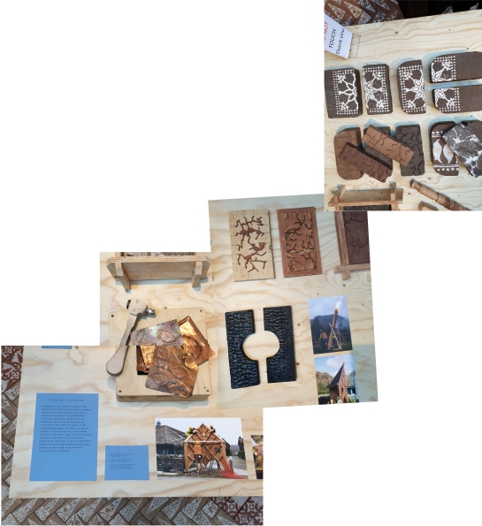
Takeshi Hayatsu Architects (who also designed the layout of this exhibition) were involved in the renovation of the Institute, reflecting their interest in collaborative architecture. They also involved their students from Central Saint Martin’s unit called: “Reworking Arts and Crafts” and their creations like the outdoors communal bread-oven, the copper-clad information kiosk and other handmade artefact are on display. Also the decorative bricks that are made there have been used to create a beautiful floor for the project’s little pavilion within the exhibition. Part of the institute is also the honest shop, where artefacts are sold in a price that the buyer considers fair. A little shop is set up within the exhibition as well.

community6

Hastings Pier by dRMM


A small ramp ascents from the Mechanics Institute exhibit to the last of the projects that is presented in this exhibition which is Hastings Pier. The Pier along with its gradual deterioration eventually also caught fire. Its complicated ownership status (in public use, eventually bought by a private owner in 2017 and then through a private share scheme local residents became part-owners of the pier) did not make renovation works easy. The trust that was funded after the first public meeting in 2006 raised the funds (majority from Heritage Lottery fund) and involved dRMM led by Alex de Rijke who is a pioneer in timber design and construction.

community-7

Hastings Pier by dRMM


As mentioned very eloquently in the introductory text of the exhibition: “Public buildings offer spaces to meet, participate, learn and play. They can improve our health and well-being, enable interaction across diverse social and demographic groups, and create a sense of community and civic identity through placemaking.”

The very low importance that has been given to them lately is obvious when we see that the first budgets to be cut because of austerity, are the community operated ones. And this is sadly telling of many sociological and political problems that this country is currently facing. When communities are not deemed as important enough to invest in, something is really wrong in our society. Fortunately, there are communities that find ways out of the dead-end through self-organisation with the help of like-minded designers. And this exhibition is important because it clearly demonstrates that.

The exhibition will be on until the 27th of April 2019

Have a look at their website here

Big2

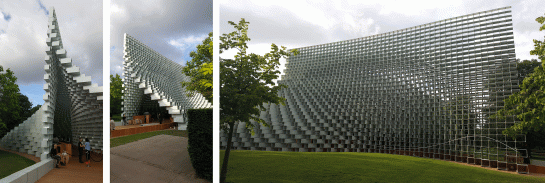
This year’s Serpentine pavilion was designed by Big, an architectural practice whose main force is the 41 year old Danish architect Bjarke Ingels. The practice’s signature is using simple lines in a bold way to support a conceptual story. Usually there is also a playful element in Big’s projects and the user of the building is urged towards a rather adventurous, at times even childlike behaviour. For example they have designed a waste-to-energy-power plant in Copenhagen with a roof that is in fact a ski slope and the Serpentine pavilion (if it weren’t for health and safety measures in the UK) was originally meant to be climbed to the top.

Big1

Left photo:Copenhagen Power plant CGI by Big

The pavilion, as has been observed by many writers already, is quite beautiful. It encloses the space but but it also “leaks” views to the park from certain angles. The structure does not however manage to protect from nature’s elements very well, but really how many of the pavilions ever did? Similarly as far as its spatial qualities are concerned, like many of its predecessors, it photographs better than it feels when visited.

Big4

This year though I would like to focus on an event that I attended when I went there for the first time, on June 24th one day after UK’s famous referendum that decided the future of the country within the European Union. That strange day, Implicated theatre a group of theatre practitioners, funded by Serpentine Galleries and directed by Frances Rifkin took over the space. Implicated theatre’s performances are based on Augusto Boal’s Theatre of the Oppressed which is an experimental workshop-based practice that aims to “explore the relationships between political speech and action”1. Usually a scene is presented to the audience who later on is urged to participate in transforming it by taking the place of one of the original actors. The focus usually is underprivileged people and their stories. Their struggles and their interpretation of their experiences within the frame of society and its political structures.

Big3

This particular performance called Towards a Radio Ballad: Songs of the Journey emerged from a year-long collaboration with unionised migrant hotel workers from Unite’s Hotel Workers Branch. As described in Serpentine Gallery’s website: “The sound piece that accompanied the performance, is a sketch working towards a possible Radio Ballad, taking its cue from Charles Parker’s original BBC Radio Ballads, a series that aired from 1958-1964.

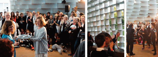
The audience was divided in two groups depending on whether they had ever worked in the Services industry or not. Walking freely within the pavilion we were given trays and by holding them the feeling of being a waiter was simulated. The stories of actual migrants who have come to London and worked as waiters were heard in the background. In the actual scene presented by the actors and later on moulded by the audience’s participation, a waiter was cheated out of his tips by the head waiter, a common story of professional abuse of power. I will not go into details on what happened as the experience of it is what really matters.


Big5

Photographs by Lewis Ronald

The intellectualisation of a workshop-based performance where everyone’s conclusions are purely personal would diminish the importance of the experience with weak generalisations. In the end though we were all given seats and a microphone went around. People spoke of how they felt and shared thoughts on their being in that particular space as part of the group. Very personal stories were heard that attested oppression and injustice. Migrants’ search for a better life by leaving their country of origin were juxtaposed with the dramatic political events in the country, as the decision of the previous day’s referendum. Ultimately the migrants’ journey instead of easier is going to become much more difficult. Surrounded by the loose boundary of the pavilion, we were confronted with the sad reality of a world that chooses to become more closed-minded and closed-bordered. And the feelings were real, people spoke of their lives and their families passionately and even cried.

Big6

Left photo by Lewis Ronald. Middle and right by the writer

Never did I expect to experience the sharing of real emotions and harsh truths about major political events, especially in a group, within the Serpentine Summer Pavilion. A space which is a product created and consumed by an international cultural and economic elite. Most nights at the pavilion not that many working class people are present, other than the waiters of course. And there is not that much truth spoken by the well-groomed guests that sip cocktails while exchanging empty pleasantries.

June 24th ‘s performance placed a small bomb of controversy within the fabric of the pavilion focusing on the lives of those who stay in the background unseen and uncelebrated. The space of the pavilion did not matter to me that night, not because its architecture was unworthy but because no architecture should be more important than the people who inhabit it.


Big7

1. From Implicated Theatre’s website

Serpentine Pavilion’s website here

Big’s website here

Read about Theatre of the Oppressed here

Implicated theatre’s website here

Park nights Towards radio website here

Serpentine15-2

I know this is beyond old news. In fact the pavilion has only one day to go until it is taken down. My article was so extremely delayed partly because of personal reasons and partly because I was so underwhelmed by this structure. Still I thought it made sense to write something about it, even if it is only for the records.

Serpentine15_4

Same as every year I try to turn a blind eye to the waste of money that the Serpentine is (this year Goldman-Sach’s money to be exact) and focus more on its artistic value. It is built as an architectural experiment in order to remind to the public that architecture is an art and it may carry strong representational and symbolic values. As Brian Eno pointed out in his John Peel lecture on BBC radio 6 recently, art is basically not necessary. Eno said that art in most areas of culture is exactly what one does not need in order to survive but ultimately is exactly what brings to us the greatest pleasure.

Serpentine15_3

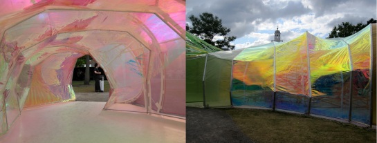
Things get complicated with architecture because undoubtedly it is an art but a structure cannot really claim the title of “architecture” if people cannot enter it or use it. According to most historians this is the very reason why the Parthenon in Athens is not really considered a building. More often it is seen as sculptural work of art because it was never entered by the cult’s believers. Naturally I would not even try to associate this shiny-plastic worm of a “building” with the Parthenon. The only thing that they have in common is the fact that they both were not used as a shelter of any sort. Obviously I am exaggerating because the entrance to this year’s pavilion was not forbidden. However on the beautiful summer day that I visited it I witnessed people rushing out of it more than they were willing to stay in it. The reason was that it had a micro-climate. It was extremely warm and humid the fans which were installed inside had to work full time in order to make any short stay there bearable.

Serpentine15_6

Selgascano, the Spanish architectural office that won the commission was not aiming for that effect I am sure. They did not do much to anticipate it or prevent it either. No aesthetic goal is important enough (according to my standards) to counterbalance the lack of viability of a building.

Serpentine15_1

And this particular one did not even manage to reach a very high standard of aesthetics either. It looks cheap, the plastic looks and feels and like plastic and the ribbons give a juvenile and crafty air to it. Not to mention the metal structure which supports it that according to the contractors had to be extremely precise for the structure to hold nonetheless, managed to look totally random.

Serpentine15_5

The one real success of this year’s Serpentine pavilion is that it is very photogenic, hence it scored high Instagram-points. Appearances are most important nowadays, people are more keen to photograph their food than eat it. Therefore this hot-air balloon is both literally and metaphorically exactly that: bright colourful and totally devoid of substance and meaning.

Serpentine15_7

The Serpentine pavilion website here

Selgascano website here

Brian Eno’s John Peel Lecture here


20 Fenchurch Street Tower or Walkie Talkie as it is usually referred as is not far from where I live. I watched it go up slowly for years and I never particularly liked it. To be more accurate I actually always disliked it. Every time I cycle west down Whitechapel Road it dominates the skyline totally filling up the horizon.

20 Fenchurch building seen by Whitechapel street and Algate East. Dominating the horizon

20 Fenchurch building seen by Whitechapel Road and Algate East. Dominating the horizon

As it was being built I realised that it was flaring up the taller it became. For a little while I appreciated its geometry and was rather intrigued by the potentially interesting engineering calculations it required. However when I came across the drawing of the original idea and saw how much taller it was supposed to be it occurred to me that there was something wrong with its proportions. Proportions determine a building’s scale hence are extremely important.

The Walkie Talkie hovering over the street

The Walkie Talkie hovering over the street

Therefore if a building is ultimately constructed shorter and wider than its original design, it shows. And this is just one of the conclusions that one comes to by examining Walkie Talkie superficially, as a sculptural object. Something which I always find secondary in critiquing a high-rise.

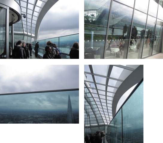
Going up to the higher part of the "garden"

Going up to the higher part of the “garden”

Researching a bit the building’s Skygarden I discovered that it was not part of the original concept. The tower which is not situated in the part of the City where all the other high-rises are, was at first denied planning permission. The case was eventually reviewed and permission was granted because the architect pledged to give the top floor to the public. A smart and cheeky move. I am usually put off by investors’ justifications. Especially when they advertise their generosity which is often a calculated move in order to get their way.

Another interesting fact about Walkie Talkie is that the true reason for the building getting larger in plan towards the top, had nothing to do with creativity and architectural inspiration. It was mainly a smart idea in order to increase the rentable floor space of the upper floors where it is considerably more expensive. The skygarden was the idea that helped the project go through but profit was again in the heart of that decision. A large part of the top floor’s space is occupied by private restaurants.

The restaurants dividing the "garden" in half. Bulky and disproportionate volumes

The restaurants dividing the “garden” in half. Bulky and disproportionate volumes

The garden is divided in half by the bulky volume of the restaurants and is reduced to two sloping areas where the plants are placed. The sitting areas are basically a couple of small seats in the middle of these slopes. In case they are found empty, they are impossible to enjoy as they are constantly coveted by the hundreds of visitors.

The very few sitting areas cannot really be enjoyed by anyone. A fact that beats the whole purpose of naming the place "Skygarden"

The very few sitting areas cannot really be enjoyed by anyone. A fact that beats the whole purpose of naming the place “Skygarden”

Places like this, especially when there is a deadline in the time that one is allowed to stay there, make relaxing there extremely difficult. Ultimately this is a space to be consumed. It exists to go see and maybe take a selfie at, in order to be able to say, “been there done that”.

Of course there is the view, which is undeniable. Any 360 view from a high building is always fascinating. Even from this particular building which most people find rather ugly. The proportions are wrong the detailing is wrong, it feels clumsy and crude and somehow pretentious.

The building is rather crudely detailed. Lacks elegance but offers some good views

The building is rather crudely detailed. Lacks elegance but offers some good views

And to top all that, it melted a couple of cars and set the carpet of a shop across the street on fire with the beam of sunlight that was reflected off it before its brise-soleil panels were installed. Later on its architect Rafael Viñoly stated that he remembered London less sunny which to say the least seems like a ridiculous excuse for the poorly thought out implications of the building’s geometry.

Diagram of how the reflected sunbeams (also known as the deathray) melted parked cars and burned shop carpets

Diagram of how the reflected sunbeams (also known as the deathray) melted parked cars and burned shop carpets

The experience of visiting Skygarden did not leave an indelible impression in my memory. Yes it was free which was good but one has to book in advance, bring a photo ID and go through the airport-like security of x-rays and metal detectors. The hostesses in fake fur that check the IDs and give information look like airline hostesses giving a sexualised 60’s air to the experience that made me rather uncomfortable.

The hostess the metal detector and what you see as you come out of the elevator

The hostess the metal detector and what you see as you come out of the elevator

Once upstairs I did not go immediately to the terrace as most people do. Instead I felt the need to check out first the “garden” which in fact is not visible when you first step out of the elevator. Going up the steps towards the higher level of the “garden” I had what I call “a Planet of the Apes moment”.

My "Planet of the Apes" moment. When it crossed my mind that we are nearing the end of civilisation

My “Planet of the Apes” moment. Seeing the top of other skyscrapers through the plants

Seeing the Gherkin and the Cheesegrater towers through the plants, reminded me of the classic science fiction film when the protagonists realise that the end of civilisation has occurred as soon as they see the remains of the statue of Liberty. The top of the towers through the plants was a similarly compelling image.

Inside the sky garden the restaurant balcony looks like the desert

Inside the sky garden the restaurant balcony looks like the desert

After that I went further up at the restaurant’s terrace which is shockingly bare. What garden? That was the desert. So sad, empty and disorientating, as far away from the concept of the garden as possible. The whole experience seemed more of a hoax. Eventually I went outside to the terrace where I enjoyed my 15 minutes of false superiority that any visit to a skyscraper ultimately is all about.

20 Fenchurch Street's terrace experience

20 Fenchurch Street’s terrace experience

Once again I got to think about how twisted the whole concept of public space is getting to be. This place is as public as any London square owned by a private company that you can quietly stay in if you obey a set of rules of behaviour. No skating, no smoking, no protesting, no rough sleeping and who knows what else. Public space seems to be turning into a plane of restrictions which slowly but surely squeezes the freedom out of our lives. This is not as science-fiction-like as it seemed during my Planet of the Apes moment. Slowly but surely the only thing allowed in these so-called-public places will be to marvel at capitalism’s overwhelming superiority, solidified in scary tall buildings that the masses will be able to admire from a distance.

Book your visit to the Skygarden here

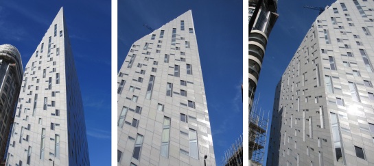
The first time I saw M by Montcalm I was cycling. The building is situated on City road really close to Old Street’s roundabout which is one of the places with the most cyclist casualties in London. Keeping this in mind I always pay extra attention when I am there. That particular day I exited the roundabout successfully and almost had a heart attack at the sight of this new building hovering over me. Later on when I found out it was a hotel called M by Montcalm, I could not help but be amused as its angular and rather distorted façade looks anything but calm.

Left: Old Street roundabout / Middle: M by Montcalm from the beginning of City Road

Left: Old Street roundabout / Middle: M by Montcalm from the beginning of City Road

Being a huge fan of comic books and science fiction I would not be 100% truthful if I said I hated it, because I did not. It immediately brought to my mind Gotham City and Blade Runner. What respectable graphic novel enthusiast would not enjoy something that seems to come out of a book or a film which has been the centre of many a daydreams.

montcalm6

However the root of my aesthetic satisfaction was also the source of problems for this building which has an out-of-this-world quality. I believe it looks like some funfair ride or a film set. Probably its façade’s geometry is not the only reason for that. The materials chosen play some part too. The finish of the cladding for example gives to it a rather precarious and not exactly sturdy character.

montcalm3

Attempting to find out more about this building I was at a loss with the absolute lack of information available about it. Who exactly designed it? No one seems to be claiming it even though on the Montcalm website it is repeatedly mentioned that an award winning firm is responsible for it. However its name is not stated, why? Eventually due to one of my readers that left me a comment under a previous version of this article I found out the company behind the design and the construction of this building was Squire and Partners. You can have a look on their webpage where they explain the concept here

Moorfields Eye Hospital which is exactly opposite M by Montcalm

Moorfields Eye Hospital which is exactly opposite M by Montcalm

M by Montcalm is betting heavily on the area being branded as Tech City, a technological start-up apparently third in the world in size after San Francisco and New York. Tech City has received funding in order to boost the companies it hosts which mainly develop new technologies. Google’s headquarters are not far from here for example. I guess the hotel expects to attract many guests related to Tech City’s companies.

Unfortunately the building is not yet finished and I could not enter it. Admittedly I am quite curious to see if the interiors are even remotely influenced by its exterior appearance. I would be quite disappointed and not exactly surprised if they were not. Judging from the hotel’s website it does not seem that the interior spaces mirror the exterior. Naturally in case they were, the hotel might have looked even more like a fun fair ride. However it would have been a proof that there was some sort of concise architectural concept behind it and not only an aesthetic gimmick.

Middle : Old Street roundabout from M by Montcalm

Middle : Old Street roundabout from M by Montcalm

Which leads this train of thought to the inevitable consideration of the effect of a building’s appearance to the street and the responsibility the architects have on account of it. This debate is a never ending one since the beginning of the history of architecture. Naturally there could never exist one absolute truth. Aesthetics are subjective and no one can pronounce they have created a building that is objectively beautiful. Every new addition to any street is a reminder of boundaries between public and private and can initiate discussions about matters of taste but most importantly motives behind aesthetic choices. The beauty of architecture as an art largely derives from the fact that it brings together necessity and technology wrapped in the amalgam of a designer’s and a client’s taste. Matters get much more complicated when the client is the state which has specific agendas to push or (as contemporary economies have it), faceless companies which mainly chase after profit. Montcalm with its luxury hotel branding has contributed this building to the streets. I often think like most designers do, that bold is better than boring. But this is only one angle of looking at things.

montcalm5

chamberlin-powell-bon1

The Chamberlin, Powell & Bon exhibition at the Barbican despite its small size, is worth visiting and I can attest to that as I have enjoyed it twice already. The main exhibit on display is a series of square photographs that were chosen to be featured on the seasonal greeting cards the firm used to send to its clients. The pictures are all square-shaped, similar to the hugely famous Instagram format of the social media with the same name. Chamberlin, Powell & Bon, quite ahead of their time, favoured the square frame recognizing its power.

chamberlin-powell-bon2

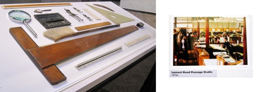
The context of the pictures though is what is of importance. Looking at these images is like looking through an architect’s eyes. Form, rhythm and composition, shadow and the contrast of light and dark and of course, the human scale. This collection of photographs is a very good example of how architects were trained in the past. Attention to detail and great love for their labour is manifested on their handmade drawings that took months to produce.  The scale rulers, the drawing compass and the triangle on display are reminders of of the architectural synthesis process  as it used to unfold during previous decades. There is no doubt that this process is quite different to the one we have today.

chamberlin-powell-bon-3

Chamberlin, Powell & Bon were all teaching architecture at Kingston Polytechnic when they entered and won the Golden Lane Estate competition which is situated right next to the Barbican. Golden Lane was and still is a Council Housing project. Since it is often said that with this project the architects developed and tested the ideas they eventually used on Barbican, the latter has often been confused as a social housing project itself. This naturally brings harsh criticism upon the Barbican as it is a known fact that the prices for an apartment in the complex are truly sky-high. You can have a look here.

chamberlin-powel-bon-5

The Barbican was never meant to be a social housing project. It was supposed to encompass however many concepts that Le Corbusier and other modernist architects developed which definitely did not only have to do with aesthetics. Their goal was to reinvent urban living: to entwine private and public space, to provide cultural spaces and events, gardens and athletic facilities within in the same building complex. That was Modernism’s social agenda that brought humanitarian meaning to architecture for decades. The Barbican will always be an architectural monument for modernism and its galleries and performance spaces will continue to provide high quality cultural services. Still its most amazing feature is Barbican Centre’s spaces which are open to the public. Many times I go there and bring my computer along with my lunch to spend time writing next to the lake or in the foyer. The free wi-fi is much appreciated by many people who come here to work or study as friendly spaces where you can sit without having to buy and consume something are getting fewer by the minute.

chamberlin powell bon 6

Left Instagram by architect Irena Mavromati

Unfortunately the extraordinary humanitarian ideas of architects that dreamt post war urban utopia are fading faster than ever. The Barbican is stuck in limbo between the idea of free-for-all-quality space and the luxury overpriced apartments that only incredibly rich people can afford. Therefore it is not only a unique brutalist monument but also a symbol of the architectural dream of creating a better life for all and not only for the few privileged. The current situation of overpriced housing in London, along with gentrification, privatisation and reduction of social housing prove it without a shadow of a doubt.

This little exhibition that will remain open until the 17th of May though is a modest reminder of architectural ideals in their original form. The penetrating visual observations of architects that naively chose to dream of a better future.

Architecture has been a favourite subject for artists throughout history. One of the obvious reasons is that it is very static and geometric but I find this to be too shallow of an explanation. Anything that qualifies as architecture constitutes the man-made part of our environment and as such it materializes its social structures and politics. However it also carries multiple layers of symbolism referring to the human condition. Still -as the curators of Constructing Worlds exhibition Alona Pardo and Elias Redstone have eloquently mentioned- it is extremely challenging to translate its material and sensorial aspects in a two dimensional image. This collection of images demonstrates with an interesting variety of styles of photography how this obstacle can be overturned into an asset. The very personal and ultimately subjective point of view of each photographer, highlights qualities that make up for the loss of the third dimension.

Left: Berenice Abbott Night view, New York City, 1932 © Berenice Abbott, Courtesy of Ron Kurtz and Howard Greenberg Gallery, New York. Right : Berenice Abbott Rockefeller Center, New York City, 1932 © Berenice Abbott, Courtesy of Ron Kurtz and Howard Greenberg Gallery, New York.

Left: Berenice Abbott Night view, New York City, 1932 © Berenice Abbott, Courtesy of Ron Kurtz and Howard Greenberg Gallery, New York. Right : Berenice Abbott Rockefeller Center, New York City, 1932 © Berenice Abbott, Courtesy of Ron Kurtz and Howard Greenberg Gallery, New York.

The photos on display at the first floor where the exhibit begins are more or less objective in documenting their era. Downstairs on the contrary the photographs are more subjective and artistic. The images are organised in a chronological order so the first artist one comes across is Berenice Abbott who is famous for her breathtaking 1930’s New York photos. This old-school depiction of the city which architects will always be fascinated with, is spectacular. Artistically and compositionally, the photos are perfectly balanced but most importantly they somehow manage to capture the frenzy of innovation that New York embodied at that time. Its aspiration for expansion and the hope of a new world are encompassed in them and therefore they are eternally modern.

Left: Walker Evans Frame Houses. New Orleans, Louisiana, 1936 Library of Congress, Prints & Photographs Division, FSA/OWI Collection [LC-USF342-T01-008060-E] © Walker Evans Archive, The Metropolitan Museum of Art / Right : Allie Mae Burroughs (Source Wikipedia)

Left: Walker Evans
Frame Houses. New Orleans, Louisiana, 1936
Library of Congress, Prints & Photographs Division, FSA/OWI Collection [LC-USF342-T01-008060-E]
© Walker Evans Archive,
The Metropolitan Museum of Art / Right : Walker Evans : Allie Mae Burroughs (Source Wikipedia)

While Abbott is known for zooming out and looking from afar Walker Evans is very famous for a series of pictures that he took to document the devastating effects of the Great Depression. In order to do so he zooms-into the lives of people in an almost voyeuristic way. He looks at every detail of their houses, in fact he looks close into every detail of their faces concentrating more on the personal aspect of architecture which reveals also a lot about the collective.

14.-Julius-Shulman,-Case-Study-House-#22,-Pierre-Koenig,-1959

Left : Julius Shulman Case Study House #22, 1960 (Architect: Pierre Koenig) © J. Paul Getty Trust. Used with permission. Julius Shulman Photography Archive, Research Library at the Getty Research Institute (2004.R.10) / Right : Julius Shulman Case Study House #22, 1960 (Architect: Pierre Koenig) © J. Paul Getty Trust. Used with permission. Julius Shulman Photography Archive, Research Library at the Getty Research Institute (2004.R.10)

Those who have studied architecture or its history should be quite familiar with the Shulman photos than come up next in this exhibition. The legendary case study houses, naïve as they may seem in showing-off post war luxury and picture-perfect families, are considered historically important. The Eames and Koenig houses are design prototypes that haunted generations of architects who tried to follow their example.

8.-Lucien-Herve,-High-Court-of-Justice,-Chandigarh,-1955

Left :Lucien Hervé High Court of Justice, Chandigarh, 1955 Photograph by Lucien Hervé. The Getty Research Institute, Los Angeles (2002.R.41). © J. Paul Getty Trust With permission from Fondation Le Corbusier, Paris and Judith Elkan Hervé. / Right : Lucien Hervé High Court of Justice, Chandigarh, 1955 The Getty Research Institute, Los Angeles (2002.R.41). © J. Paul Getty Trust With permission from Fondation Le Corbusier,

Lucien Hervé was not only admired for his unique talent but also for the opportunity he had to be Le Corbusier’s chosen photographer in documenting his iconic work. He travelled to Chandigarh to witness the construction of the High Court of Justice and the Secretarial Building. The images reveal the dramatic chiaroscuro that is created by the concrete and India’s sunlight and are works of art in their own right.

13.-Bernd-&-Hilla-Becher,-Constructing-Worlds-installation-images-©-Chris-Jackson_Getty-Images

Constructing Worlds: Architecture and Photography in the Modern Age Bernd & Hilla Becher installation images Barbican Art Gallery 25 Sept 2014 – 11 Jan 2015 © Chris Jackson / Getty Images

Bernd and Hilla Becher have contributed the photographs of 21 water towers displayed in a rectangular grid formation. Sculptural and monolithic as their subjects are reveal the contradictory beauty of industrialisation that most contemporary architects are drawn to.

5.-Stephen-Shore,-Beverly-Boulevard-and-La-Brea-Avenue,-LosAngeles,-CA,-21-June-1974

Left : Stephen Shore Beverly Boulevard and La Brea Avenue, Los Angeles, California, June 21, 1974 Image courtesy of the artist, 303 Gallery, New York and Sprüth Magers, London © 2014 Stephen Shore / Right : Stephen Shore Holden Street, North Adams, Massachusetts, July 13, 1974 Image courtesy of the artist, 303 Gallery, New York and Sprüth Magers, London © 2014 Stephen Shore

Stephen Shore’s photographs document the environment where pop culture occurred. They depict everyday spaces, back streets, garages and fire escapes but their vibrant technicolor palette along with examples of design like cars or characteristic fonts on street signs, unmask the very specific age that they derived from.

In the downstairs part of the exhibition where the work of more contemporary artists is displayed things get much more personal. In fact the images at times seem almost psychoanalytical revealing more about the actual photographers than about the buildings and their architects.This does not mean that architectural photographers of previous decades did not have a personal point of view. True to their time though their opinions were more subtle and sought to highlight the buildings more than their own perceptions of them. Contemporary photography is less detached and objective. It is actually the exact opposite: involved and engaging and by putting the photographer’s interpretation forth it speaks of an artist’s dreams or nightmares but also of politics, social structures and conflict.

18.-Hiroshi-Sugimoto,-World-Trade-Centre,-1997

Left : Hiroshi Sugimoto World Trade Centre (Minoru Yamasaki), 1997. Courtesy of Hiroshi Sugimoto / Middle: Constructing Worlds: Architecture and Photography in the Modern Age Hiroshi Sugimoto installation images Barbican Art Gallery 25 Sept 2014 – 11 Jan 2015 © Chris Jackson / Getty Images / Right : Constructing Worlds: Architecture and Photography in the Modern Age Hiroshi Sugimoto installation images Barbican Art Gallery 25 Sept 2014 – 11 Jan 2015 © Chris Jackson / Getty Images

One of the exhibits I liked the most was of Hiroshi Sugimoto. He chooses architectural icons such as Le Corbusier’s Ronchamp chapel, Frank Lloyd Wright’s Guggenheim Museum and Yamasaki’s Twin towers of the World Trade Centre. The photographs are out of focus and simple as this idea might be the effect is spectacular and the possible interpretations can vary. These buildings need no introductions they are historic lampposts and as such they hold actual or symbolic memories for most.

26.-Helene-Binet,-Jewish-Museum-Berlin,-Daniel-Libeskind,-Untitled-9,-1997

Left : Hélène Binet Jewish Museum Berlin, Daniel Libeskind, Untitled 9, July 1997. Courtesy of Hélène Binet / Right : Constructing Worlds: Architecture and Photography in the Modern Age Hélène Binet installation images Barbican Art Gallery 25 Sept 2014 – 11 Jan 2015 © Chris Jackson / Getty Images

Hélène Binet has photographed Daniel Libeskind’s famous Jewish Museum in Berlin during construction. The play of light through the dramatic windows of a building that is considered a sculptural monument on its own, seem even more interesting as rough slits in the wall. Without glass panes and finishes weirdly imply that they could have remained like that, unfinished.

2.-Andreas-Gursky,-Constructing-Worlds-installation-images-©-Chris-Jackson_Getty-Images

Left : Constructing Worlds: Architecture and Photography in the Modern Age Andreas Gursky installation images Barbican Art Gallery 25 Sept 2014 – 11 Jan 2015 © Chris Jackson / Getty Images / Right : Constructing Worlds: Architecture and Photography in the Modern Age Andreas Gursky installation images Barbican Art Gallery 25 Sept 2014 – 11 Jan 2015 © Chris Jackson / Getty Images

Andreas Gursky chooses to alter architecture through digital manipulation. This as a method is largely used in our days although the effect is not always so blatantly outspoken. In Gursky’s work the goal is to make a very specific social commentary about the way societies are structured and how these structures are reflected on the built environment.

21.-Bas-Princen,-'Mokattam-ridge'-(garbage-recycling-city),-2009

Left : Bas Princen ‘Mokattam Ridge’, (Garbage Recycling City), Cairo, 2009 Courtesy of Bas Princen / Right : Bas Princen Cooling Plant, Dubai, 2009. Courtesy of Bas Princen

Another photographer who creates truly haunting images is Bas Princen. His work is focusing on five cities Istanbul, Cairo, Amman, Beirut and Dubai. He is interested mostly in urbanity and the way that cities by expanding reveal a lot about the social fabric that creates them. I stayed quite a while in front of the photo of Mokattam (Cairo) where every inch of open space in the area depicted is covered with trash as the city’s economy is based on recycling. I felt similar awe by looking at the image of the cooling plant in Dubai. Sleek, megalithic and soul-less brought to my mind the black slate surrounded by apes at the beginning of Kubrick’s 2001 Space Odyssey.

17.-Guy-Tillim--DIPTYCH----Grande-Hotel,-Beira,-Mozambique,-2008

Guy Tillim Grande Hotel, Beira, Mozambique, 2008 © Guy Tillim. Courtesy of Stevenson, Cape Town and Johannesburg (Diptych)

A similar feeling of abandonment is evoked in the photos of Guy Tilly. Late-modernist post colonial blocks in decay speak eloquently about the false promises that were given to Africans. Decay is also one of the central themes in Simon Norfolk’s photographs but this decay is inflicted suddenly on the cities that he visited because of war. Sadness but weirdly also irony is the message that he seems to convey, especially in the images of vibrant natural sunset colours.

25.-Simon-Norfolk,-A-secuirty-Guards-booth...,-Herat,-2010-2011.-Burke_Norfolk.-Courtesy-Simon-Norfolk

Left : Simon Norfolk A security guard’s booth at the newly restored Ikhtiaruddin citadel, Herat, 2010 – 2011. Courtesy of Simon Norfolk / Right : Simon Norfolk Former Soviet-era ‘Palace of Culture’, Kabul, 2001 – 02. Courtesy of Simon Norfolk

The large format pictures of Nadav Kander who has travelled in China to document activities and structures across the massive Yangtze River portray a country that is extremely contradictory. Traditional but modernised, communist but expanding with capitalist aggression. Vast but densely populated.

10.-Nadav-Kander,-Chongqing-XI,-Chongqing-Municipality,-2007

Left : Nadav Kander Chongqing XI, Chongqing Municipality, 2007 © Nadav Kander, courtesy Flowers Gallery. / Right : Nadav Kander Chongqing IV (Sunday Picnic), Chongqing Municipality, 2006 © Nadav Kander, courtesy Flowers Gallery.

Iwan Baan photographed Torre David, the Centro Financiero Confinanzas in Caracas, Venezuela. A huge tower block that due to the 1994 financial crisis was left unfinished and empty for a decade. Eventually it was squatted by no less than 3000 inhabitants that transformed it slowly but efficiently until it became habitable. Their apartments and communal activities are displayed in these images which document an impressive collective venture that seemed to have worked wonderfully for a number of years. The housing shortage which is a global problem and a possible solution are both mentioned here along with Torre David’s unfortunate ending when its residents were evicted in the summer of 2014.

1.-Iwan-Baan,-Torre-David-#2,-2011

Left : Iwan Baan Torre David #2, 2011 Image courtesy of the artist and Perry Rubenstein Gallery, Los Angeles. / Middle : Iwan Baan Torre David #10, 2012 Image courtesy of the artist and Perry Rubenstein Gallery, Los Angeles. / Right : Iwan Baan Torre David #1, 2011 Image courtesy of the artist and Perry Rubenstein Gallery, Los Angeles.

Architectural photography has changed a lot throughout the years and this exhibition follows its transition. The photographers portray the buildings and the history of the people who created them because undoubtedly in observing architecture closely one is actually looking at humanity and its ways of inhabiting the world. This collection of images reveals a lot about political history and art history as well. We see clearly how artists true to their time crossover from a hopeful but also clean-cut way of being to a deeper, quasi- psychoanalytical manner of looking at society and its material creations. Uncomfortable as it might be, our world seems to be getting increasingly unfriendly and with more conflict than ever and it is no coincidence that these artists choose to highlight that.

If you are in London until the 11th of January do not miss the chance to catch this exhibition.

Find the exhibition website here

Read more information about the photographers at the exhibition here

Find a podcast of curators Alona Pardo and Elias Redstone discussing the photographers’ work here

tonkin_liu1

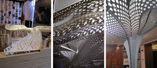
Tonkin Liu’s architecture is certainly impressive both aesthetically and conceptually.  Parametric design usually is because of its intricacy. This particular work’s aesthetic reminded me slightly of Islamic architecture although the latter Is intricate in regards to decoration and not as fas as the actual structure is concerned.

Islamic Architecture

Islamic Architecture

Attempting an almost simplistic definition of parametric design, it is the production of structural forms, using variables and algorithms which generate a hierarchy of geometric relations. In other words the variable (usually a certain structural part) follows a specific ‘rule’ in movement, rotation or distortion and its repetition or its development ultimately produces the building’s form.

tonkin_liu2

This design tool has been quite fashionable the last 25 years or so as the architects have gotten increasingly infatuated with what they can come up with technology’s assistance. Looking into its history though I was surprised to find out that Gaudi’s famous Sagrada Familia is also considered an example of early parametric design. The calculation of its breathtaking vaults and arches was achieved with the help of the fascinating inverted model of plumb lines that is now placed in Sagrada Familia’s museum.

La Sagrada Familia in Barcelona

La Sagrada Familia in Barcelona. Left the plumb line model

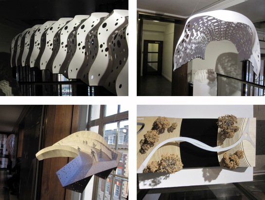
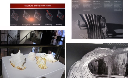
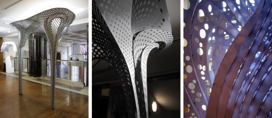
Mike Tonkin and Anna Liu started their practice in 2002. What is interesting in their approach is that they like to observe nature very closely and find ways to imitate its forms, not decoratively but structurally. Their idea of creating the lace-shell is the centre of this RIBA exhibit. In a nutshell what they wanted to achieve was to make flat sheets that would have their own strength. In their own words, to create “a suit that could hold itself up”. In order to do that they studied seashells where stiffness is achieved regardless of the thinness of the actual material. After analysing a shell’s formal characteristics they narrowed down certain qualities the combination of which result to its strength. Curvature, corrugation, distortion, stiffening and beading.

tonkin-liu3

The next phase was to develop the algorithm that would combine the above and in doing that they also introduced another element in their study: perforation, which aimed to reduce the volume of the material and make it lighter. Reading their Prototyping Architecture essay (download it here) I was impressed with how observant they are with nature and the way they attempt to incorporated the lessons they learn from it in their design. For example the reduction of volume with the method of perforation is an interpretation of how caterpillars strategically munch on leaves without ever compromising the leaf’s structural integrity because if they did, naturally they would fall off it themselves.

tonkin-liu4

The organic aspect of Tonkin Liu’s design is what elevates their work aesthetically. In the past I was never taken back by most parametric architectural examples I came across. Somehow they all looked similar, mostly because they seemed rather soulless and a bit too technical for my taste. This kind of work is different though. It is undoubtedly inspired.

Keeping in mind that the algorithmic development for these projects is more complicated than most it makes sense that Tonkin Liu would need extra help. This is where the equation becomes even more complicated and the famous statement “the cause does not justify the means” becomes relevant.

tonkin-liu5

Lend Lease, the colossal multinational corporation that has funded the talented architectural team’s research, has delivered in the past architectural icons such as the Sydney Opera House. However the last few years it has been behind two very controversial developments in London that have forced thousands out of their homes in order to raise the land value and attract more desirable clientèle. These developments are non other than the Olympic park and the Heygate Estate in Elephant and Castle and like most similar projects they have been presented to the public as regeneration of run-down areas when in reality their goal was an immorally disproportionate profit compared to the damage that was cause to the social fabric of the affected areas.

tonkin-liu6

There is no doubt that this work is spectacular but to my eyes it loses most of its value. Romantic as this may sound, I believe that choosing one’s allies is at times more important than the quality of the final product. In fact I find very negative that people get so immersed in their work that they fail to look at the bigger picture. History has shown that experiments which took place in the expense of the underprivileged, ultimately got the place they deserved in the public eye’s opinion. Although nowadays more people than most are willing to turn a blind eye when external beauty is extraordinary enough.

Find Tonkin Liu’s website here

Find the exhibition’s website here


lou-khan-1

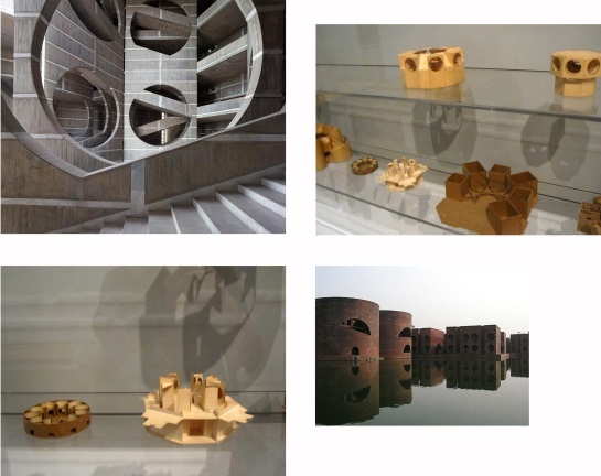
Megalithic, minimal architecture is most definitely not my cup of tea. Yet weirdly the Indian Institute of Management in Ahmenabad by Louis Khan is one of the most beautiful buildings I have ever seen in my life. Kahn stated that the concept behind it was to wrap the building with ruins in order to generate passive climate control. This is how genius he was, he created poetry by the use of absolute, strict logic. How many other architects or artists were ever able to do that? The way that I am moved by Kahn’s architecture can only be compared to the feeling I get when I look at images of Gordon Matta-Clark’s art. A delightful tightness in the stomach is how I would describe it. Vertigo but of a pleasurable kind, similar to that one feels facing natural grandeur like looking down from the top of a cliff.  I always thought that Matta-Clark was inspired by Khan and this exhibition in the Design Museum does not fail to mention there was a connection between the two.
Top picture : Indian Institute of Management, Ahmenabad / Bottom pictures: Gordon Matta-Clark, Conical intersect

Top picture : Indian Institute of Management, Ahmenabad / Bottom pictures: Gordon Matta-Clark, Conical intersect

Khan was brilliant and apparently more dedicated to his work than most of his peers. However he died by heart attack in a train station’s toilet with a debt of half a million dollars. Apparently he was too much of a dreamer. A true artist who never even considered to balance cost and quality in his art. He went to all lengths, he slept on the floor of his office working at all hours, calling his colleagues to complain about something at 4 in the morning and expected the same degree of dedication from everyone. He developed schemes for projects without knowing if he would ever get the commission. He continued to ameliorate finished projects when the clients have long stopped paying him. Hence the debt. Money was not important, ever. Architecture was important.

Left: Louis Khan's notebook / Right: Down town Philadelphia study (not built)

Left: Louis Khan’s notebook / Right: Down town Philadelphia study (not built)

Often his non-negotiable views on architecture though were to cost him grand commissions like that of designing the centre of Philadelphia. Even though he was invited to produce a scheme, his concepts were never materialized because they were considered too utopian. This failure of his is documented at the beginning of Design Museum’s exhibition and the public is therefore warned about the architect’s seemingly unrealistic intentions.

In one of the videos screened in the exhibit, Mario Botta says that “Lou” was not only fascinated with the outcome of his work, the built product, but with the process of creating it as well. Regardless of how obsessed he might have been with the artistic process, science and construction were still extremely important aspects of his work. Kahn among other thing is known for his invention of servant and served spaces.

Yale Art Museum. Tetrahedral ceiling 'servant' space

Yale University Art Gallery. Tetrahedral ceiling ‘servant’ space

An example is the tetrahedral ceiling grid for Yale University’s Art Gallery, the geometry of which is revisited at the Philadelphia City Tower project, a massive model of which can be found in this exhibition.

Philadelphia Tower project. (Was not built)

Philadelphia Tower project. (Not built)

In general I enjoyed the models I saw at the Design Museum a lot. Some of the most fascinating ones are naturally the original work models that his office produced for the capital of Bangladesh in Dhaka. Those rough cardboard jewels look like geometric puzzles that one is challenged to solve and they materialize perfectly their creator’s complex dream for space.

The Capital of Bangladesh in Dhaka. Building and original models

The Capital of Bangladesh in Dhaka. Building and original models

All of Kahn’s values which were ultimately ingrained in his architecture are highlighted in this exhibition: science, community, landscape, timelessness. This is achieved with simple but eloquent texts, videos and photographs but most importantly with original hand drawings, sketches and models. This is why this exhibition is not to be missed, because it displays masterpieces that once were only humble traces of an architect’s mind. Rough doodles on a piece of paper meant to instigate a conversation with an employee or client.

Top: Exeter Academy Library / Bottom: Kimbell Art Museum

Top: Exeter Academy Library / Bottom: Kimbell Art Museum

Many of his buildings did not look very impressive from the outside. The exteriors of Exeter Library and the Kimbell Art Museum for example resemble factories. Upon entrance however they unfold miraculously proving that the experience of the person who uses them was what really mattered to Khan.

Similarly the few houses he built show his intentions of designing them to become homes to their owners and not self-absorbed works of art. In general the “quality and not quantity” aphorism is very appropriate for Louis Kahn’s architecture.

Original drawings sketches of Louis Kahn's house designs. Model: Vitra reproduction

Original drawings sketches of Louis Kahn’s house designs. Model: Vitra reproduction

After visiting this exhibition I remembered watching Nathaniel Khan’s documentary about his father entitled My Architect, back in 2003 and decided I needed to watch it again. I remembered liking the film the first time I saw it and I did again now. Regardless of the fact that Nathaniel Kahn is on a very personal journey to settle his unresolved issues of abandonment with his father and too much personal information is revealed in the process of doing that.

Salk Institute of Biological Studies

Salk Institute of Biological Studies

Naturally I was surprised and at times appalled by how horribly selfish and insensitive Kahn appeared to be with his three parallel families. Nonetheless as Roland Barthes has stated (in his Death of the Author essay), the creator’s personal story is not and should not be considered while evaluating his/her work. Louis Kahn was an architectural genius who inspired and motivated hundreds of students during his years of teaching and later on thousands of architects who were acquainted with his work. Not to mention the effect he had on the lives of the users of his buildings.

Capital of Bangladesh Dhaka

Capital of Bangladesh Dhaka

Ultimately there is no doubt that Kahn was an exceptionally inspired idealist of an architect. His legacy could not be described more eloquently than by the words of his friend and colleague B.V Doshi who Kahn had his last dinner with the night before he died.

Matter in spiritual terms was what mattered to him. Silence mattered to him. The enigma of life mattered to him. Those are not normal discourses but this is what he liked to talk about. When someone can understand those things he cannot be a normal person. He must be a highly cultivated soul.”

The exhibition will be on until the 12th of October. Visit Design Museum’s website page for it here

Watch Nathaniel Kahn’s documentary “My Architect. A son’s journey” here

In the past I have loved to complain about the Serpentine Pavilion not so much about particular design reasons but rather because of what it generally represents: the architectural elite. Without researching much this year’s design (I had basically only heard that it was one of critics’ favourites) I went to Kensington Gardens.

serpentine_14_1

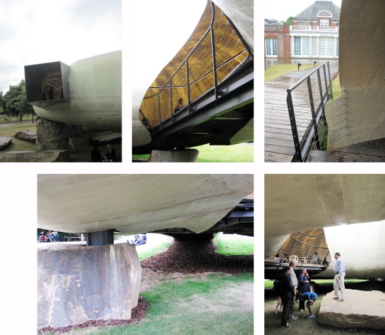
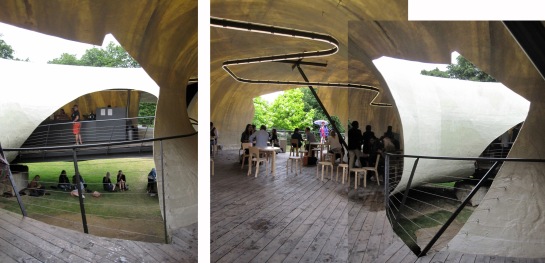
Initially this folly seems almost basic in shape. There is something ancient about it which I guess has to do with the organic-ness of its form and with the fact that its columns are sunk into really large stones placed on the lawn. Hence an illusion is created and the structure seems to be hovering over the ground. The most important reason for me liking this doughnut of a hut is that it is an introvert structure compared to most of its show-off-predecessors. And like most introverts, especially the shy and artistic types, it is full of surprises. Another reason is that it was clear to me that it was not designed for people only to come and look at it in awe. On the contrary it was made for people’s comfort, cosiness and intellectual stimulation. I run into all sorts of visitors, those who just came there to have a coffee and a chat, the ones that took hundreds of photos, studied and drew it like myself and those who just came in to take shelter from the rain.

serpentine_14_2

Whatever the reason everyone seemed to thoroughly enjoy and study it. I have the impression that this is one of those truly inspirational buildings that make people who are not already involved in architecture, want to take an interest in it. And I believe that this is achieved through innovation. Like it or not this sort of building is not something that people bring to mind when they think of architecture.

serpentine_14_4

Of course as the saying has it, everything in the arts has been done before and as architects and critics of architecture would attest, many references to other designers can be spotted in this pavilion like for example Archigram or Future Systems. Regardless of how intriguing and stimulating this style of architecture is, it is at times too progressive for its own good because it makes it hard for people to identify with it. Not to mention that architecture that has little to no references to classical forms unfortunately often ends up looking rather tacky. I believe it is extremely difficult for architects to come up with forms that are truly innovative and still manage to attract the mainstream. Probably this is because most people crave for the new but are afraid of it as well hence they gravitate towards the old and familiar.

serpentine_14_3

Smiljan Radić seems very nice in the interviews I watched. He sounds very calm and collected and really involved in his art, in a non self absorbed way. Looking into his body of work I was happy to read that he hates signature buildings and that other than very few elements he has used before in other buildings most of his projects do not seem at all aesthetically related. That is of course because they have different programs and are made for various users and climates.

serpentine_14_5

His Serpentine pavilion’s recipe of success is that it looks like something that has landed here from outer space but also somehow looks like an ancient relic, a massive rock of Cyclopean mythic architecture. It is both old and new and it brought to my mind a sort of aesthetic that I find truly appealing: retrofuturism. Above all though it is an inviting shelter for the visitor and regardless of its weirdness it manages to keep a certain degree of humility. Its interior spaces on both ground and café level were packed with people who were not admiring it, they were just living! This is what I liked about it. My stay there was a half hour exposure to utopian futurism, but hey, forgive me for being a huge science fiction fan.

serpentine_14_6

Find the Serpentine Pavilion website here

Find more Smiljan Radic projects in Archdaily here